Hallow & Sage believes that an event is more than a date on the calendar — it is a threshold moment. A space where people gather, witness, celebrate, and remember.
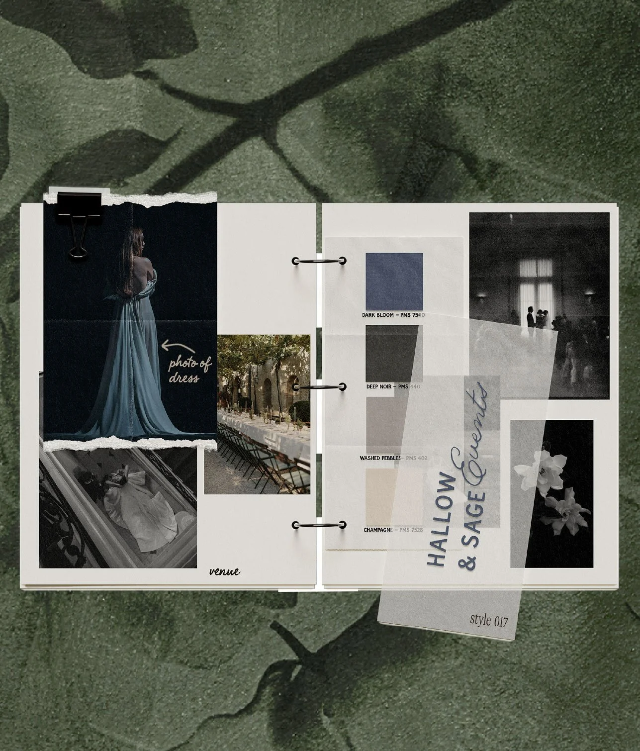
This identity blends refined design with organic romance. Inspired by wild greenery, candlelight, heirloom details, and old-world elegance, we created an atmosphere that feels somehow both grounded and transcendent.
Keywords:
Elevated, Atmospheric, Intimate, Layered.
Hallow & Sage’s brand identity was created to feel sacred, lush, and deeply intentional — a brand that lives somewhere between old-world romance and modern refinement. This brand needed to evoke candlelight, velvet evenings, and wild greenery — without leaning into cliché “rustic” or predictable wedding visuals.
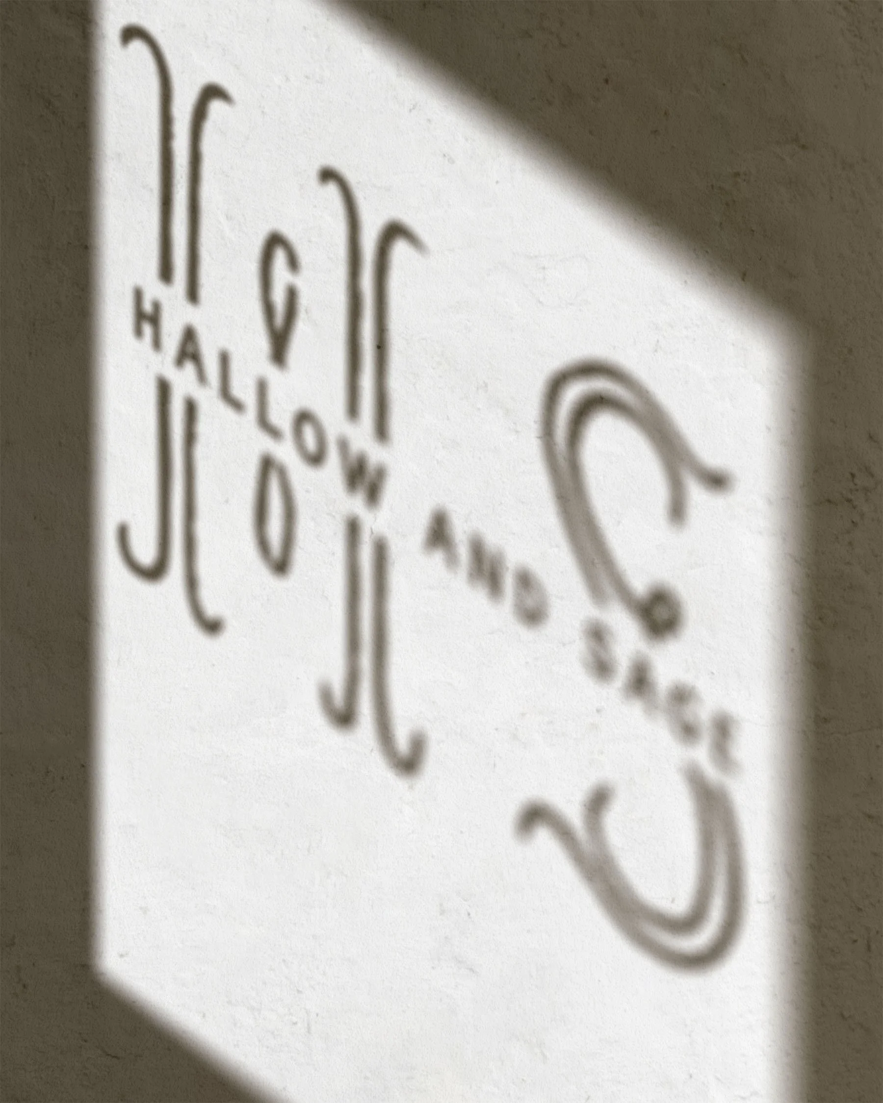
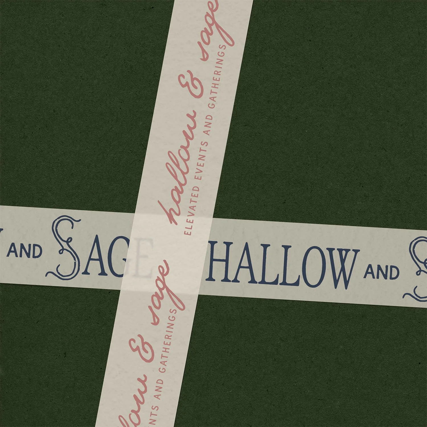
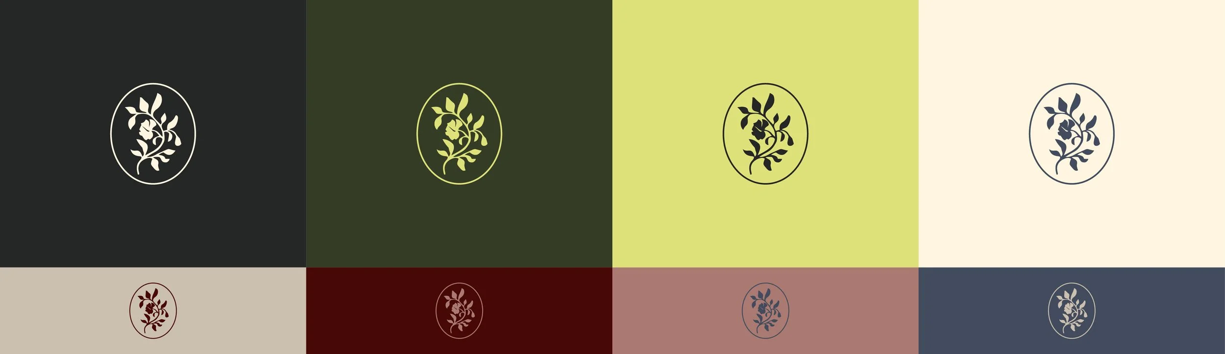
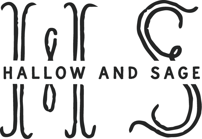
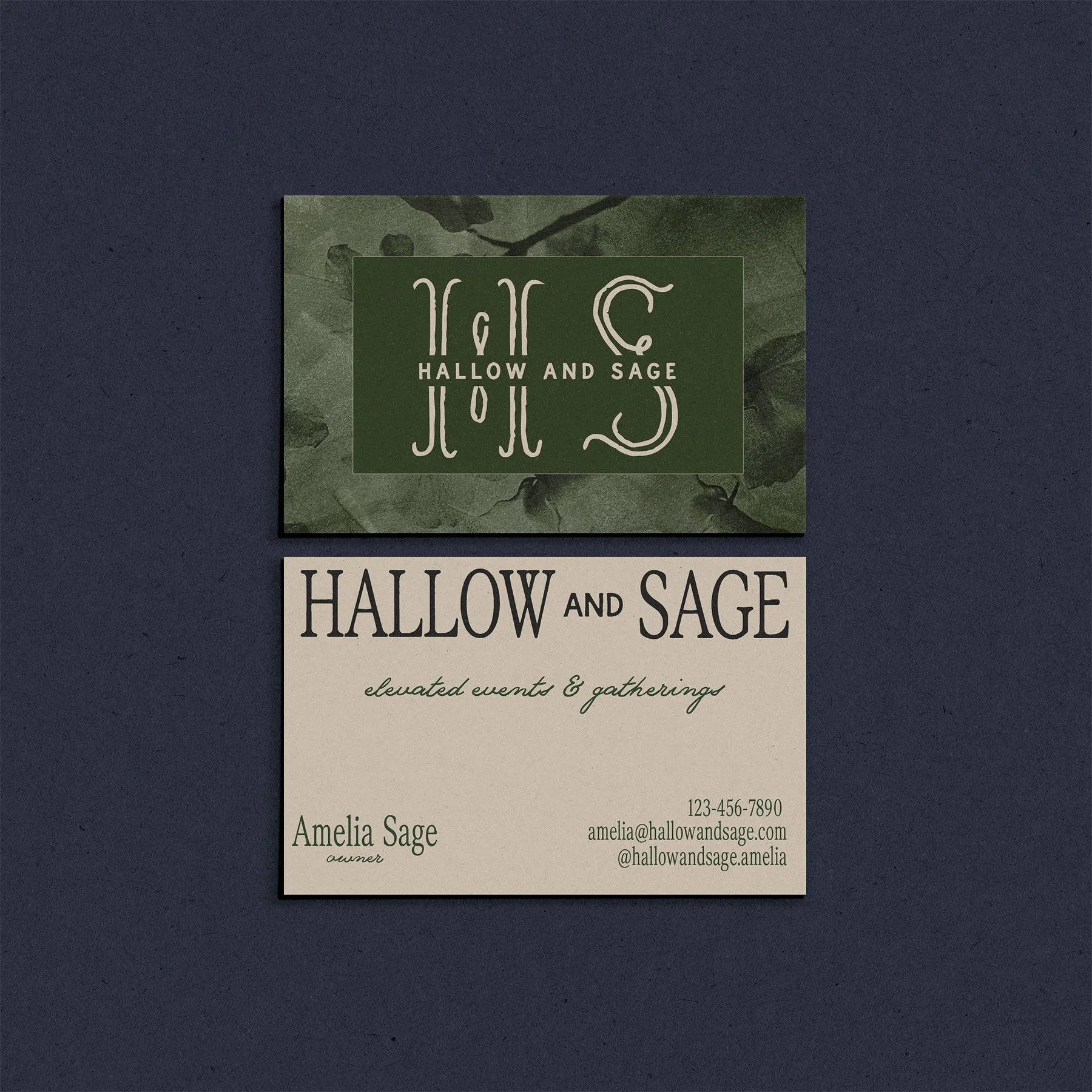
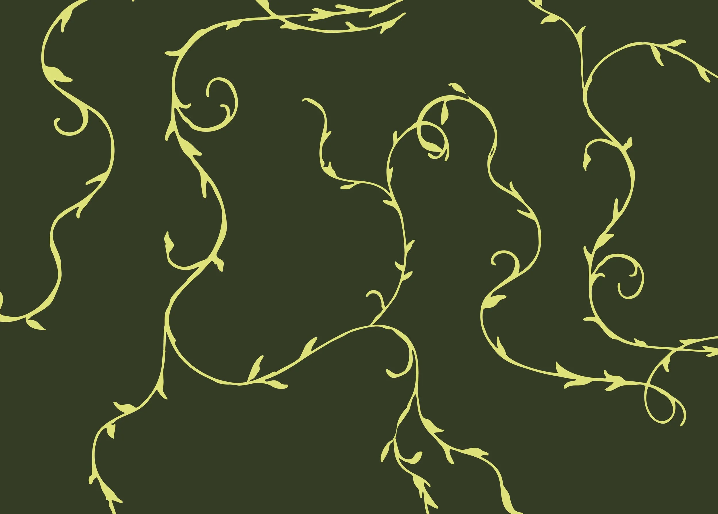
The identity blends structured serif typography with romantic, flowing script details to mirror that balance of refinement and organic movement. The elongated “S” acts as both a visual anchor and a subtle nod to winding vines — reinforcing the brand’s connection to nature. The color palette contains dark, moody colors with an unexpected neon yellow for a bold touch.
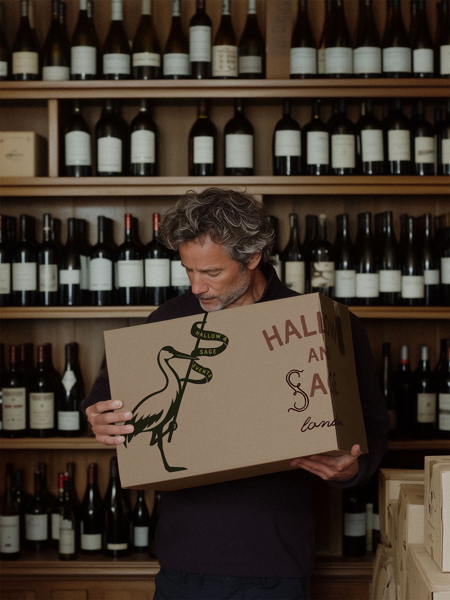
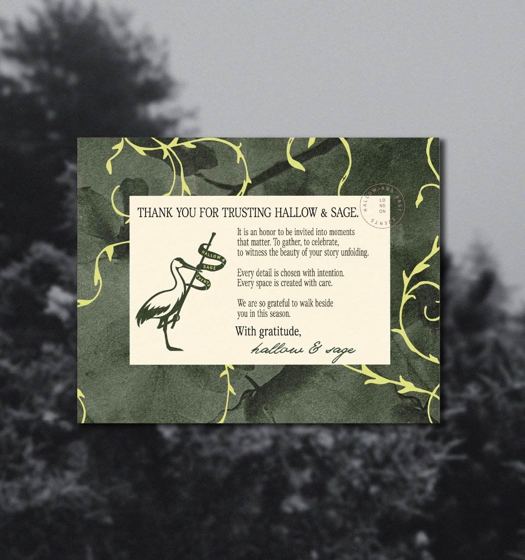
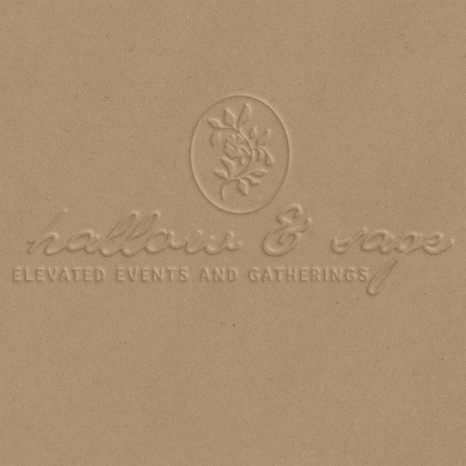
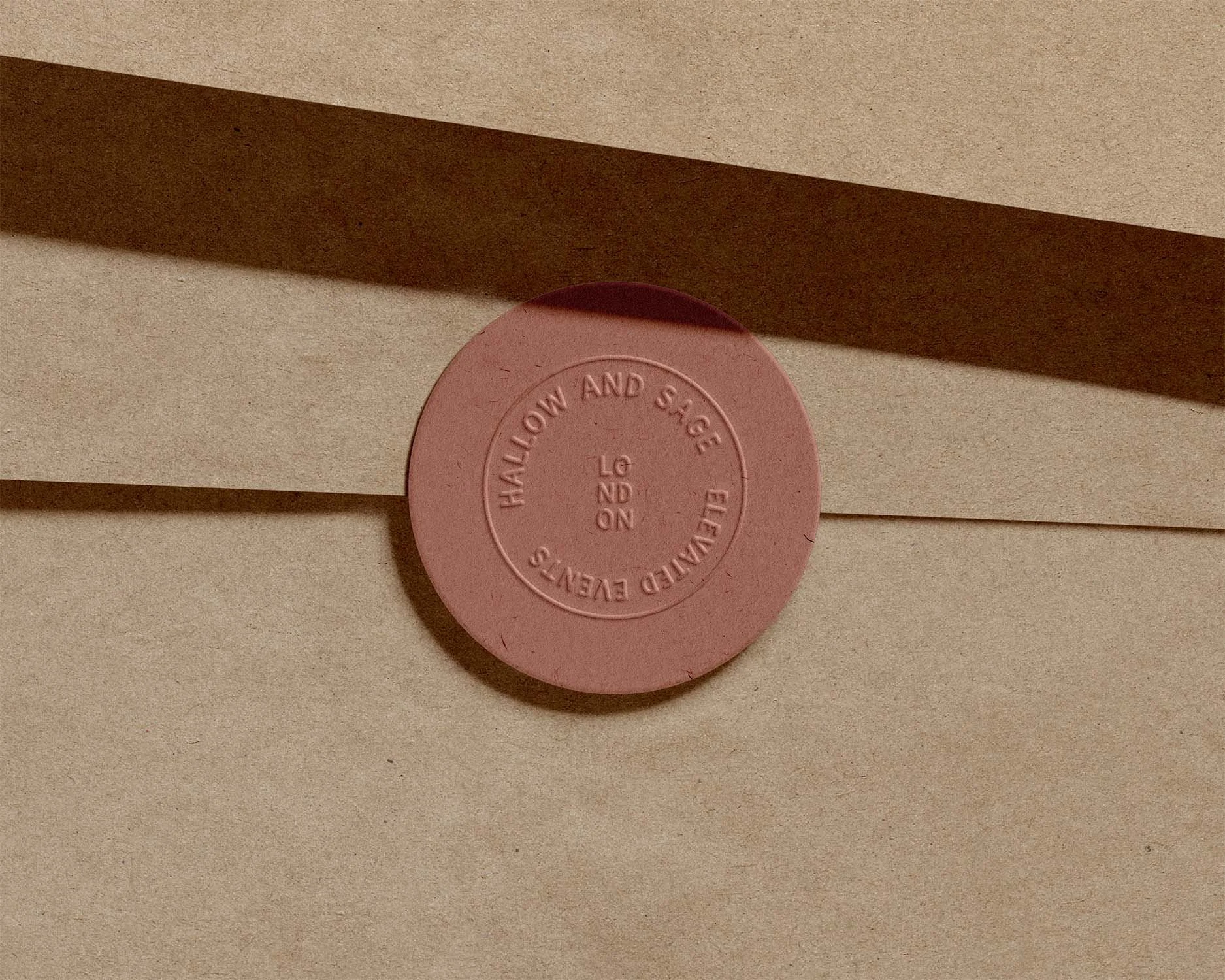
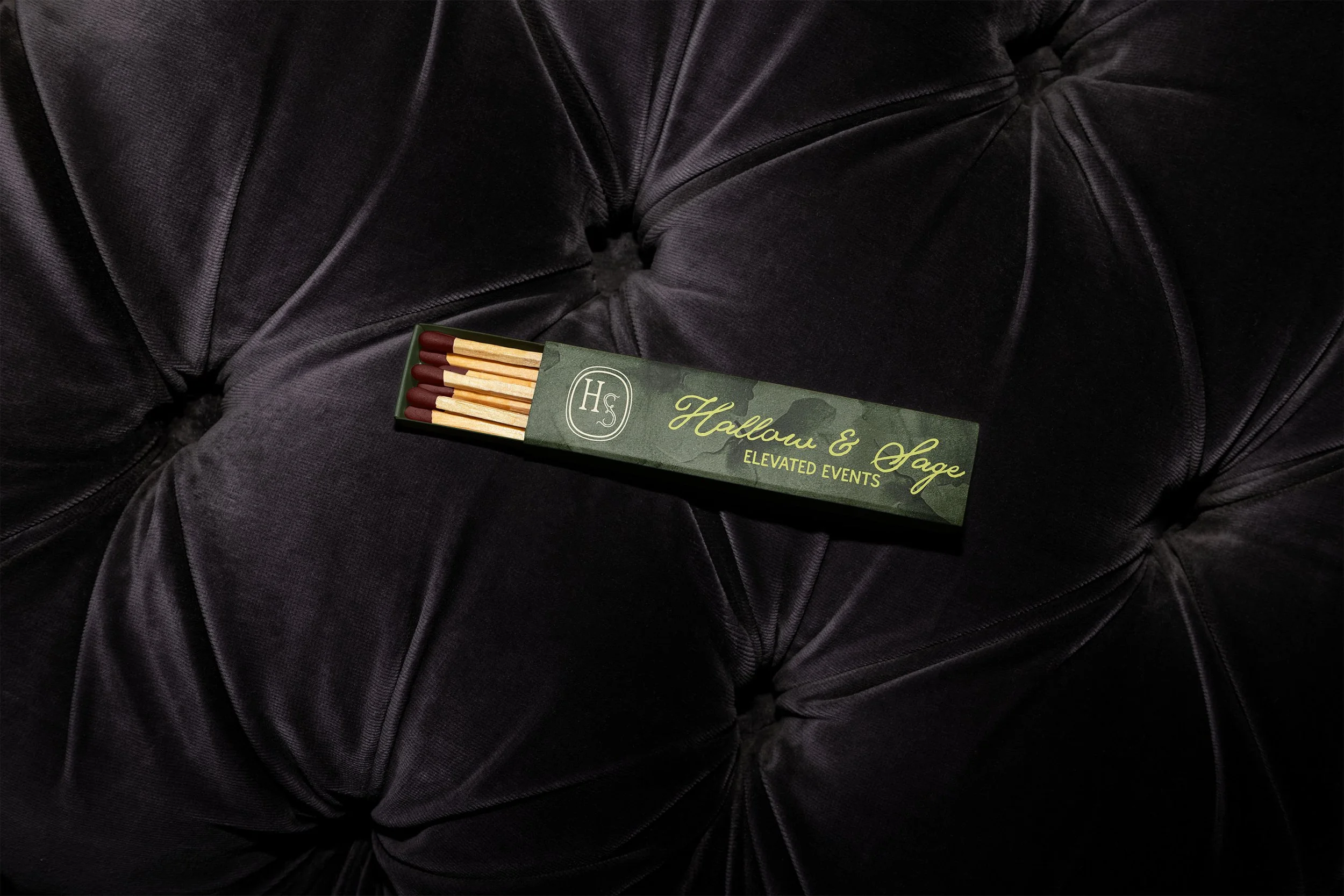
The floral crest was designed as a timeless emblem — something that could live beautifully across stationery, wax seals, menus, and digital applications.

Deliverables:
Brand Identity: One main logo, 4 alternate logo variations, 2 logo marks, brand mark, brand voice + tagline concepts, color palette + typography, brand images, hand-drawn brand illustrations, creative direction + concept designs.
Packaging Design: matches, Thank-you cards, packing tape, wine boxes
Merchandise Design: business cards, catalog cover & pages
Misc: project book mock up, social media templates

Concepts &
Taglines Explored:
“Hallow” - to honor, to make sacred
”Sage” - wisdom, ritual, grounding
“Where gatherings are honored.”
“Moments planned with intention.”
“Elevated Events & Gatherings.”