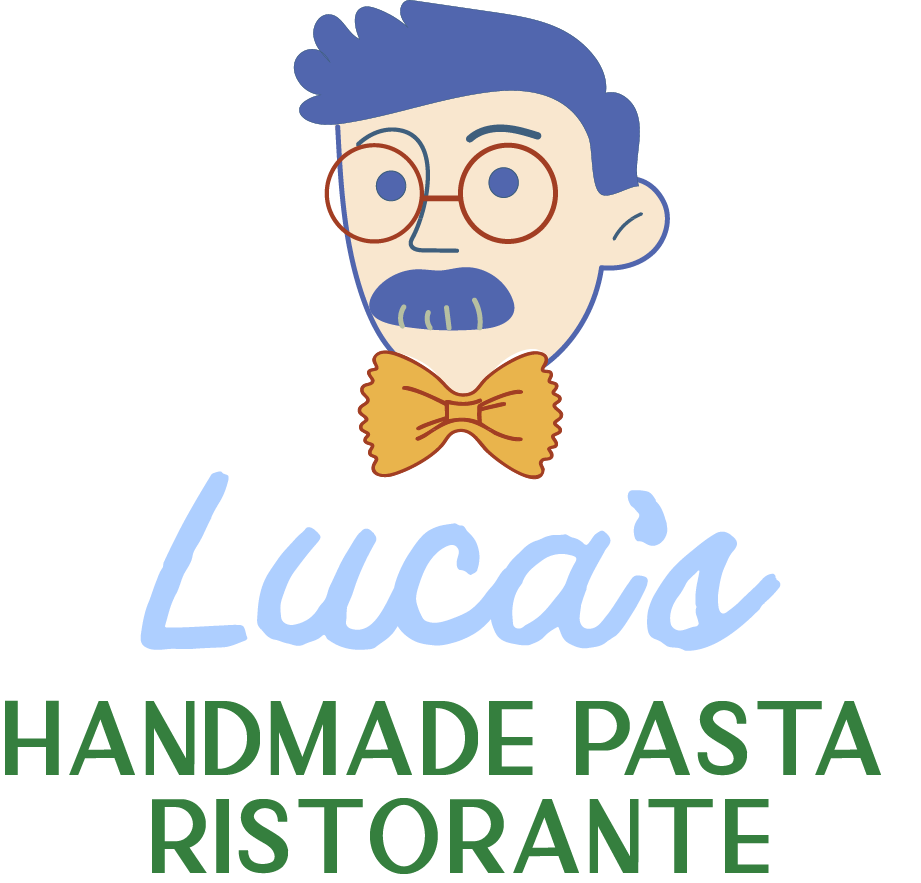
Luca’s
Handmade Pasta Ristorante
Luca’s Italian Ristorante is a modern Italian eatery that celebrates the joy of good food, good wine, and good company. It’s lively, welcoming, and a little bit cheeky — the kind of place where unique, seasonal plates meet big personalities. The restaurant wanted a brand that captured its Italian roots while standing out with color, confidence, and inclusiveness.


The goal was to bring that unmistakable Italian vibrancy to life through energy and soul. I used bold colors, layered textures, and pattern-driven graphics to evoke the rhythm of an Italian piazza: lively, passionate, and full of movement but never chaotic. Every element, from the typography to the menu design, was crafted to feel approachable yet expressive — a visual invitation to sit down, share a meal, and stay awhile.
Design Approach:
Vibrant, Welcoming, Authentic
Brand Keywords:

Taglines & Concepts Explored
“Every meal at Luca’s feels like Sunday dinner”“Big flavors, and bigger personalities.”“Mangia like you mean it .”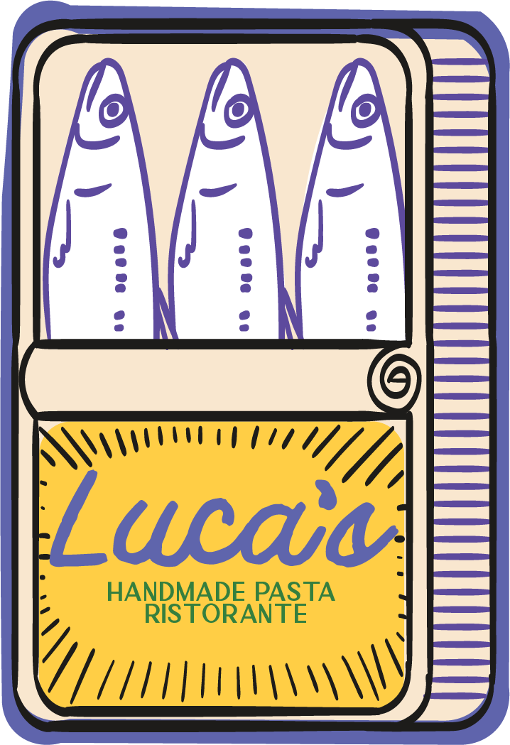

Warm, spirited, and just a little mischievous. Luca’s brand speaks with the charm of an older relative hosting you for dinner — welcoming you in with a wink and a glass of wine. The voice balances Italian authenticity with modern flair, making the brand feel both timeless and full of life.


Primary logo and logo variations
Color palette + typography
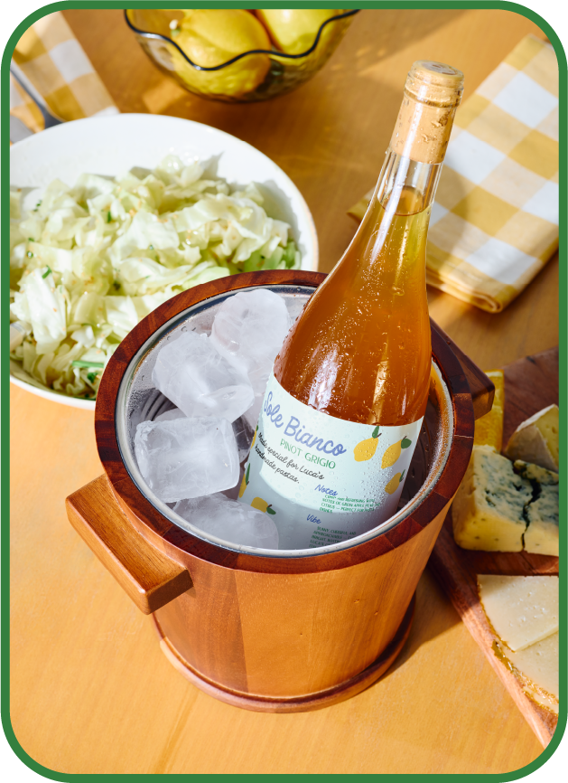
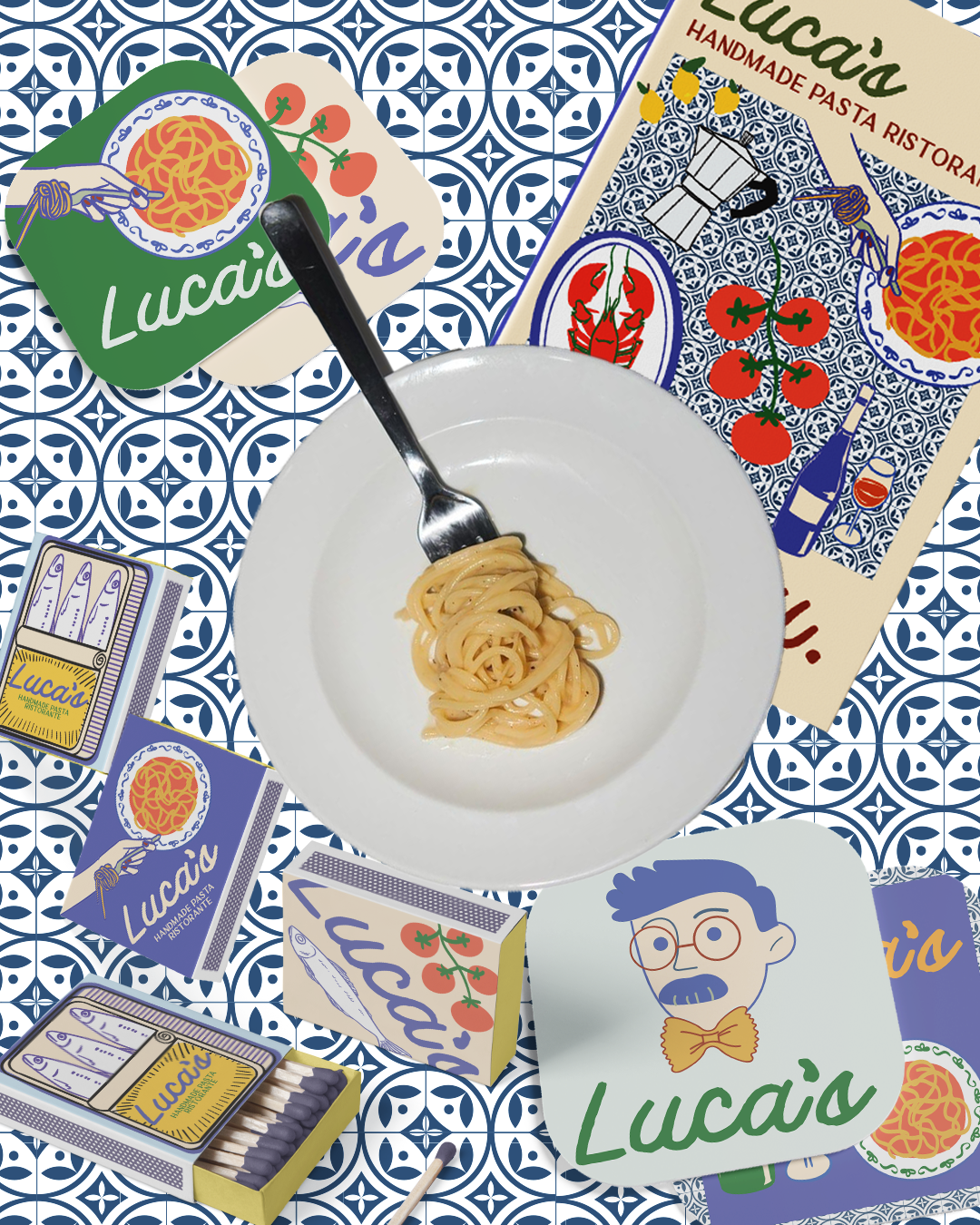
Menu and packaging design concepts, including a house wine label
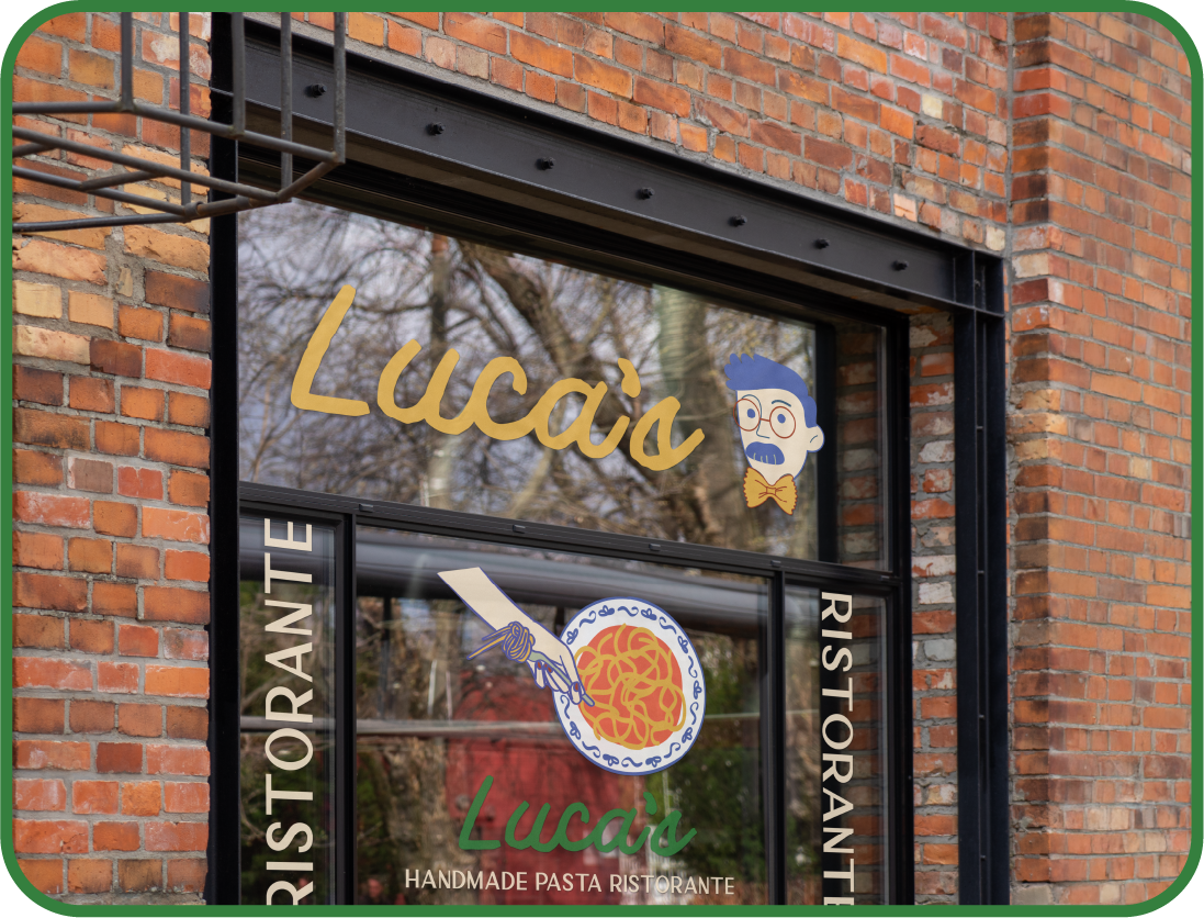
Exterior & interior and signage mockups
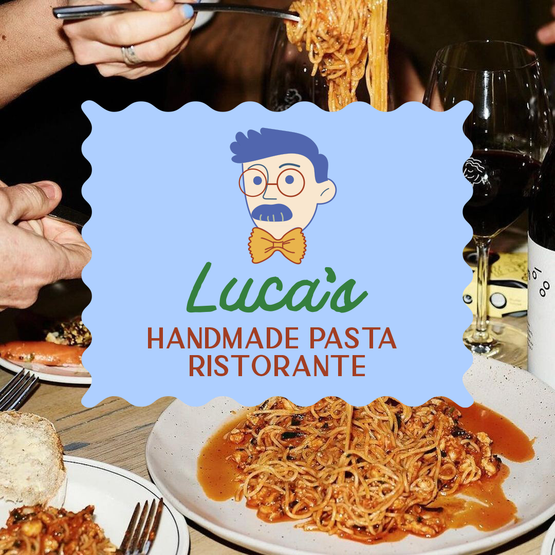
Social media templates
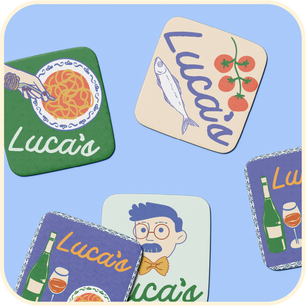
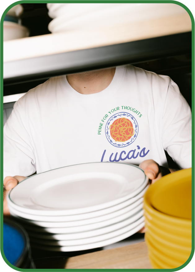
Mock-ups (Uniform t-shirt, coasters, matches, etc.)
Brand imagery direction
Deliverables Included: