MIKA MATCHA

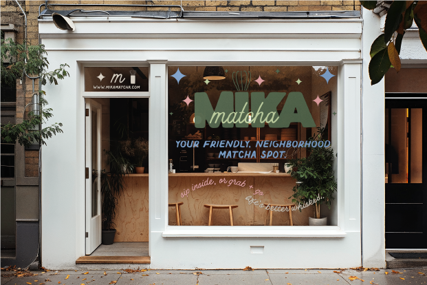
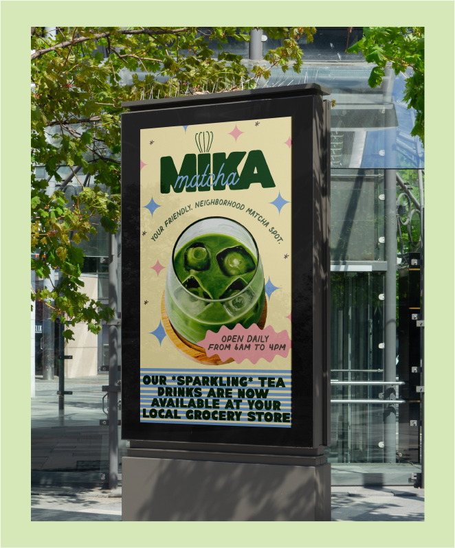
Mika Matcha is a brand concept for a premium matcha line that blends Japanese tradition with a modern, playful twist. The brand was designed to feel energizing, cheeky, and youthfully grounded — a break from the overly serene, minimalist matcha branding we’re used to seeing.


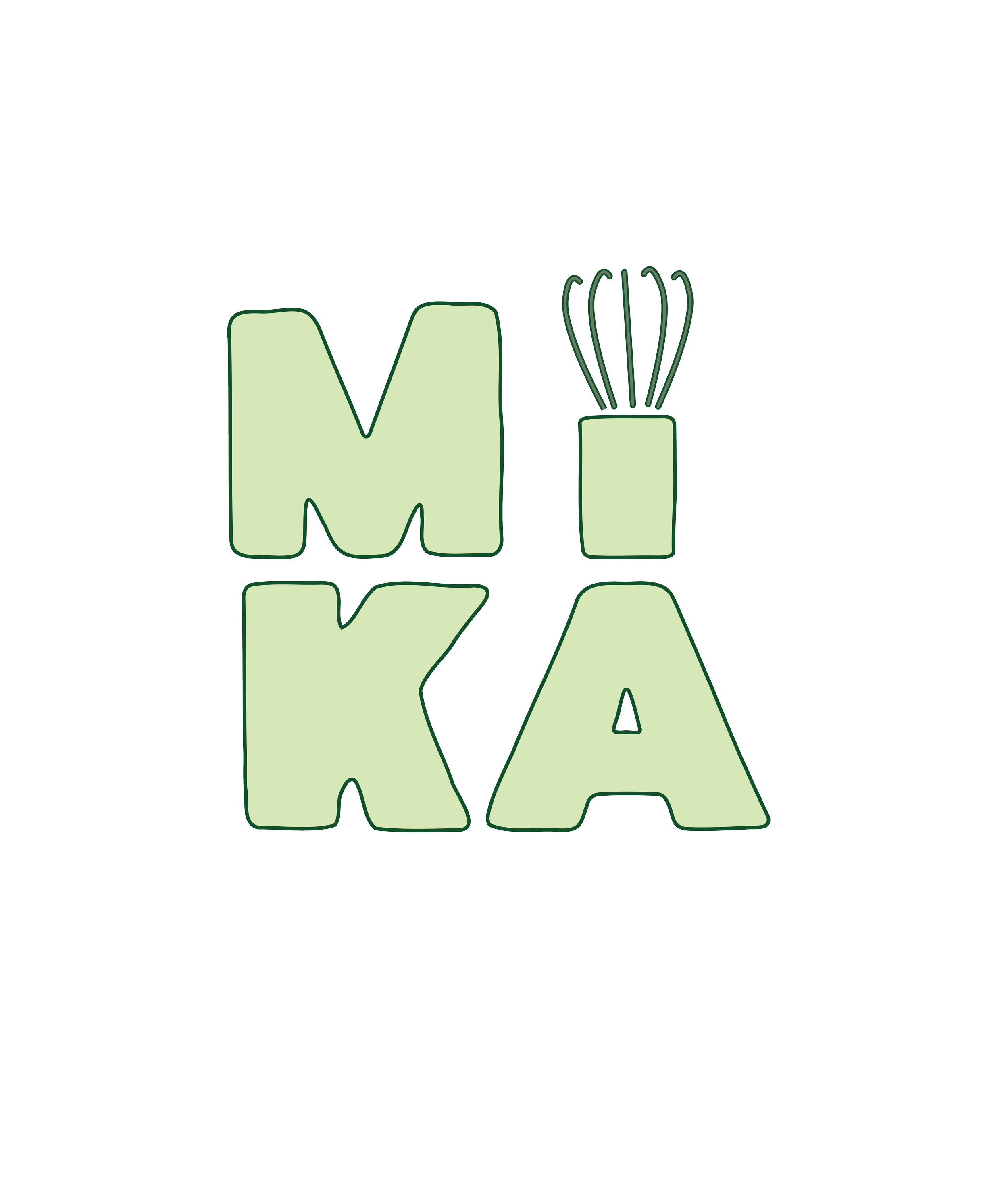
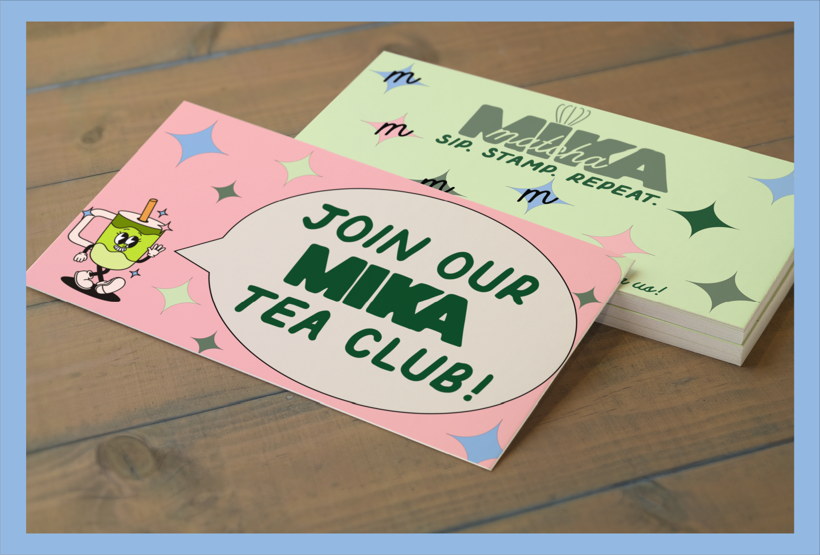
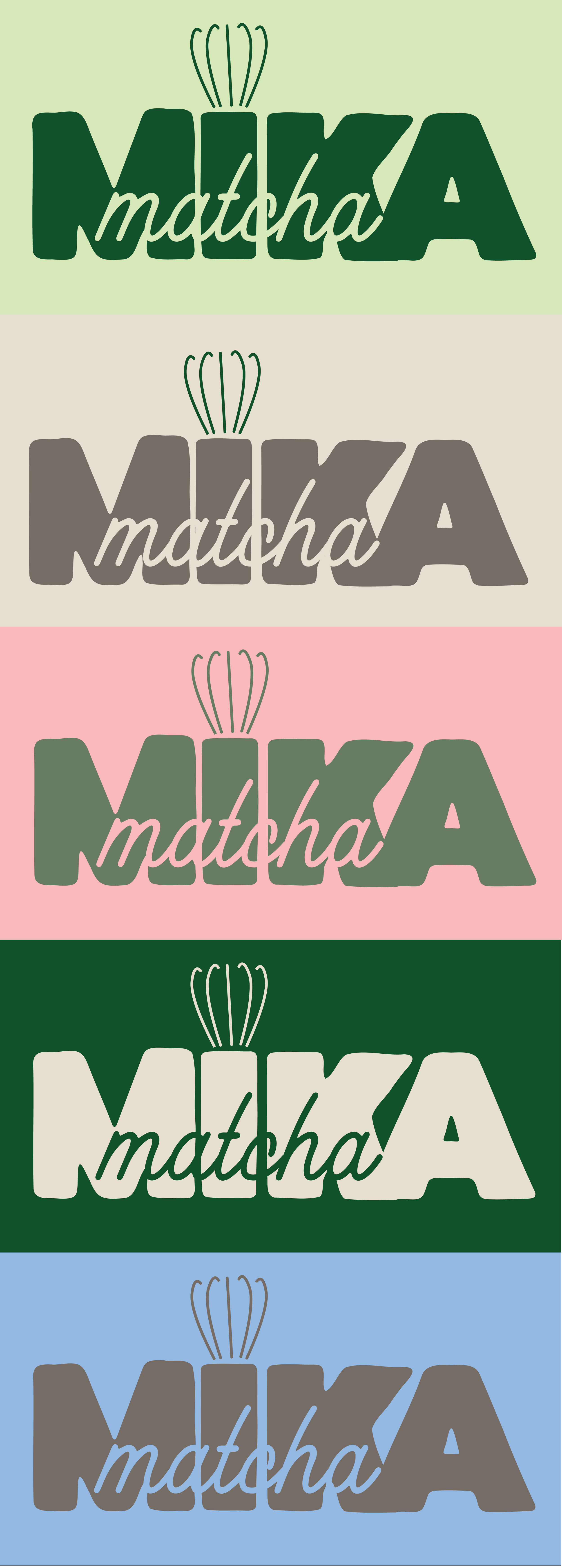
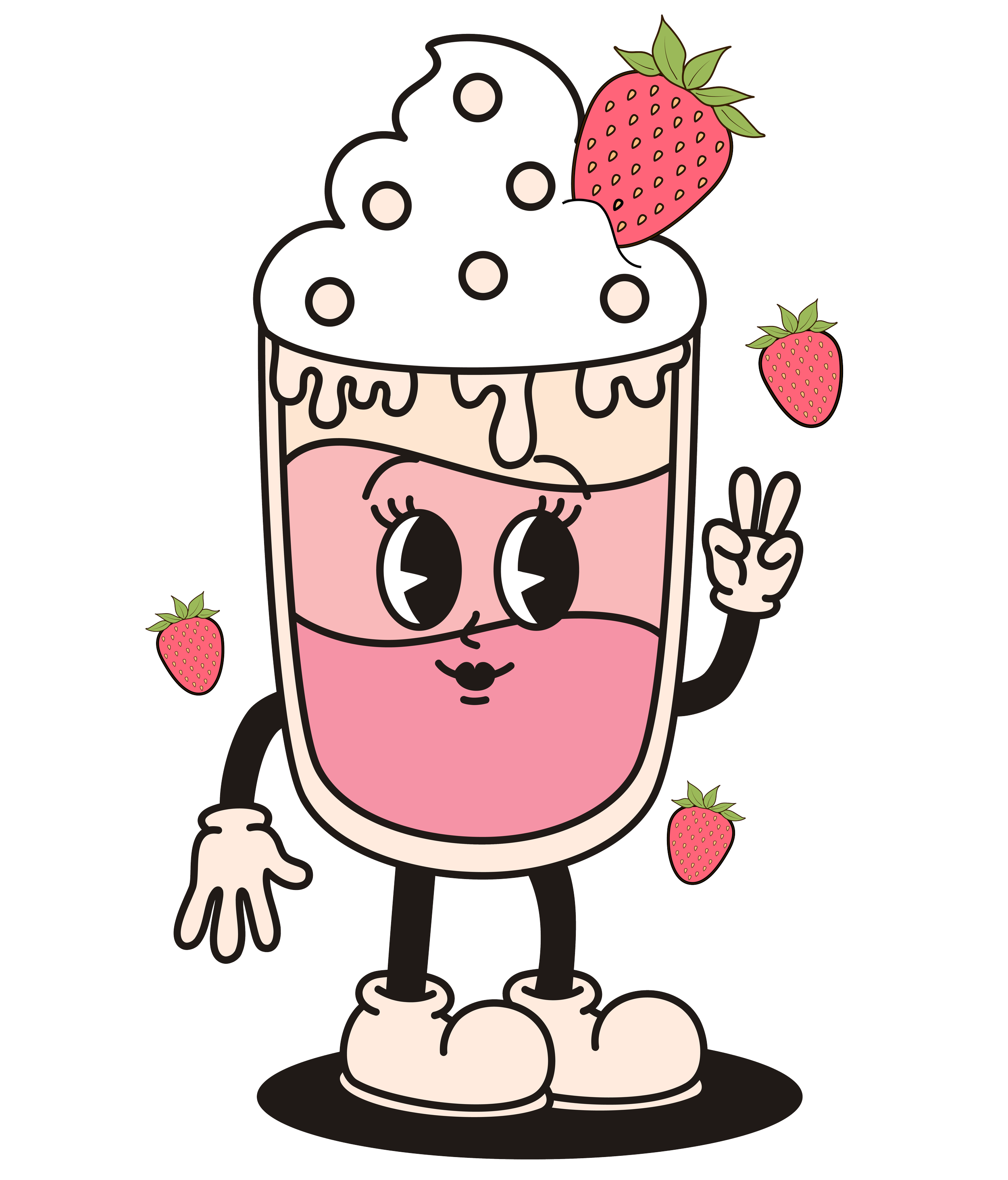
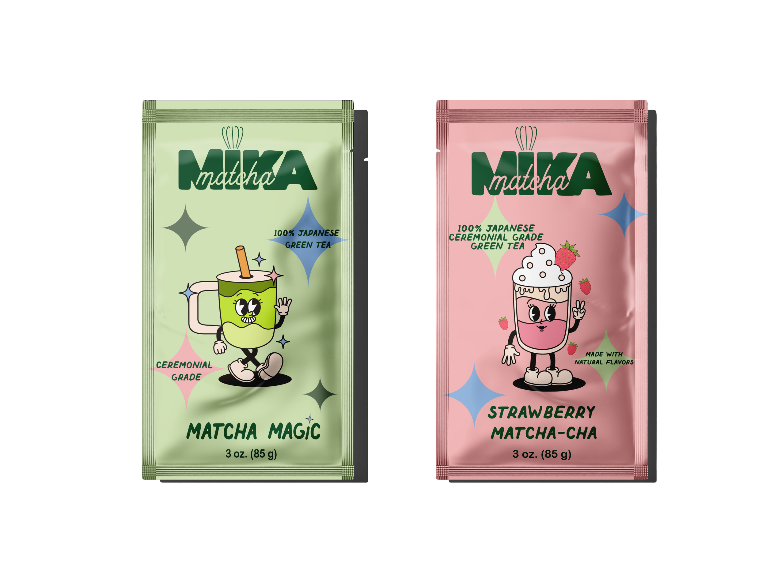
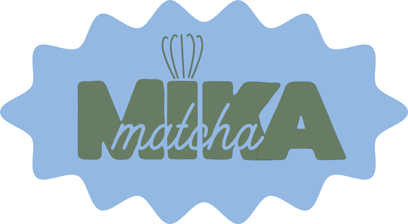
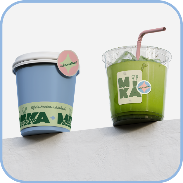
I created a full visual identity system that balances clarity with character. The logo uses soft curves and a hint of hand-drawn imperfection to keep things warm and approachable. The color palette is inspired by matcha itself — think vibrant greens, creamy off-whites, and a splash of unexpected fruit tones (like blueberry blue or strawberry milk pink) to signal flavor infusions.
Design Approach
Vibrant, Cheeky, & Uplifting
Brand Keywords:

Taglines & Concepts Explored
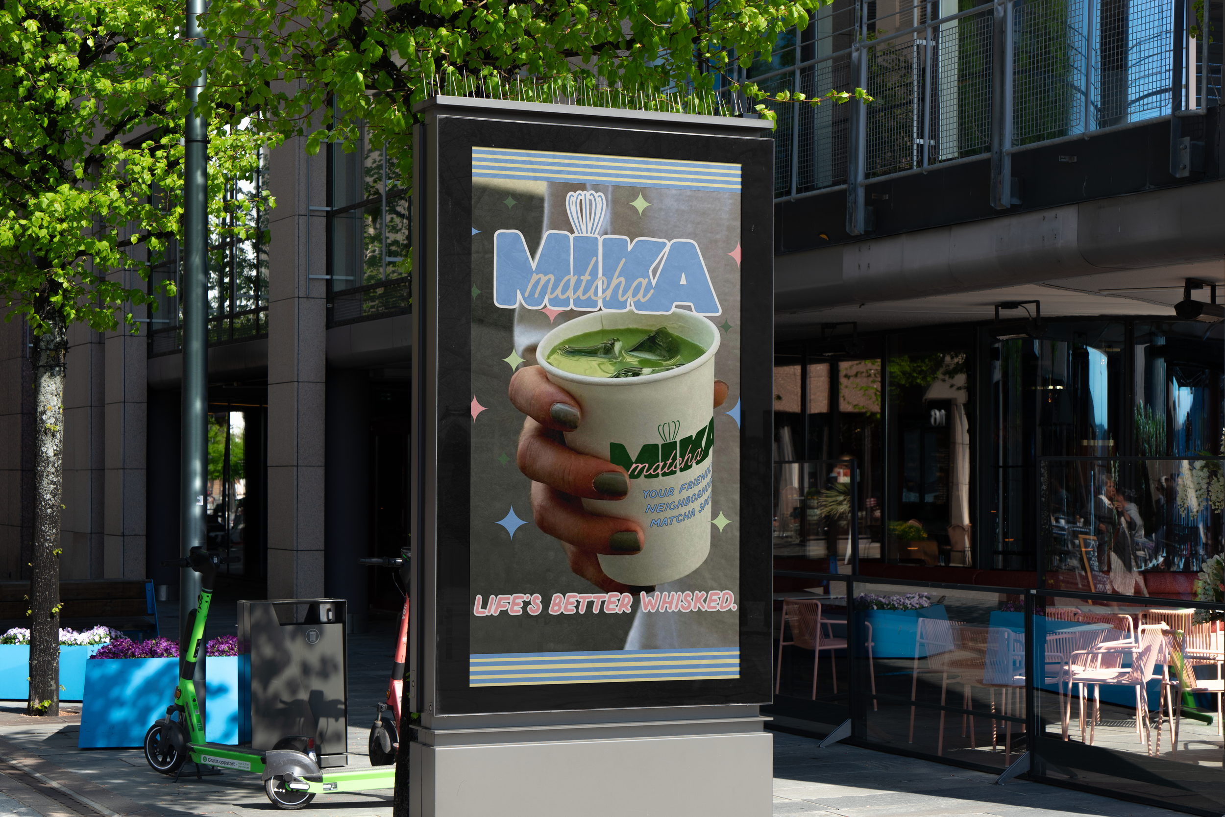
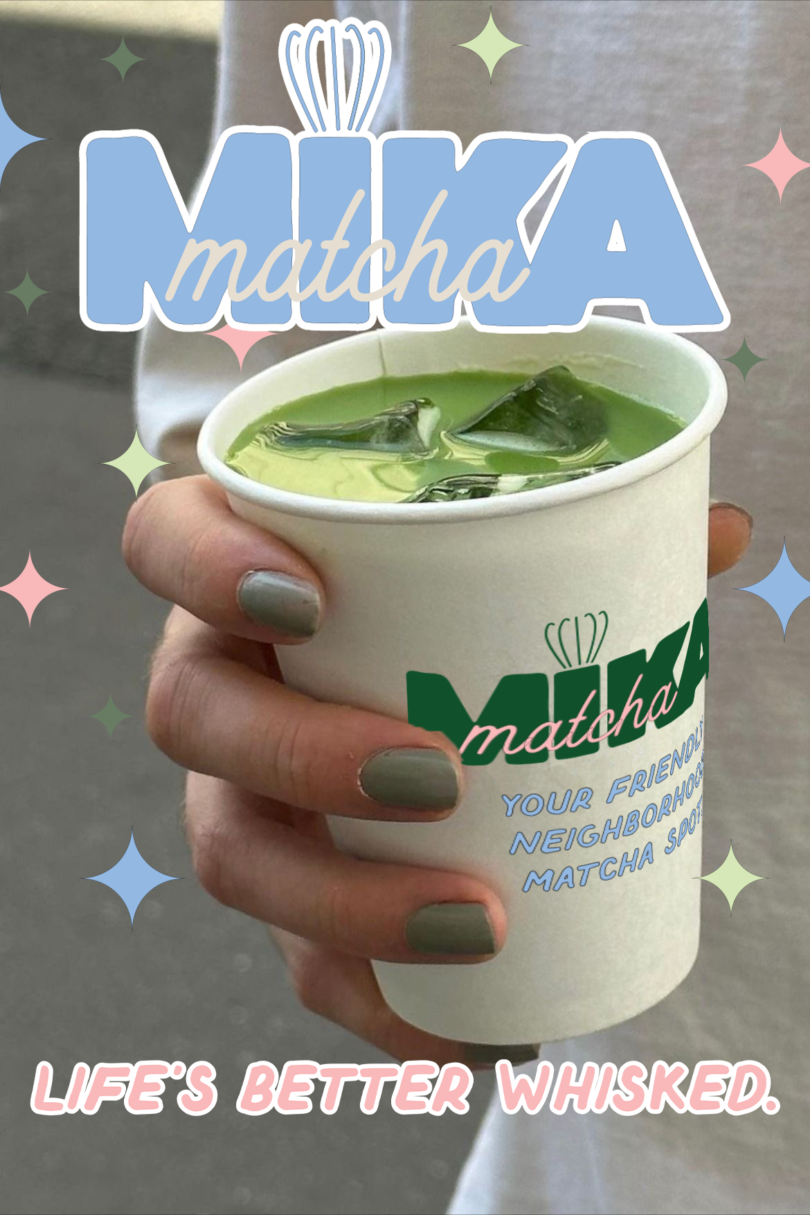
“Your matcha has a mind of its own.”“Your friendly, neighborhood matcha spot.”“Life’s better whisked.”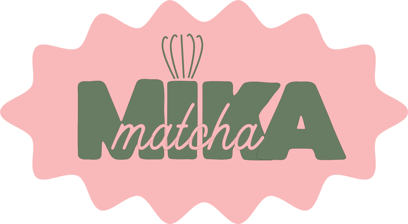
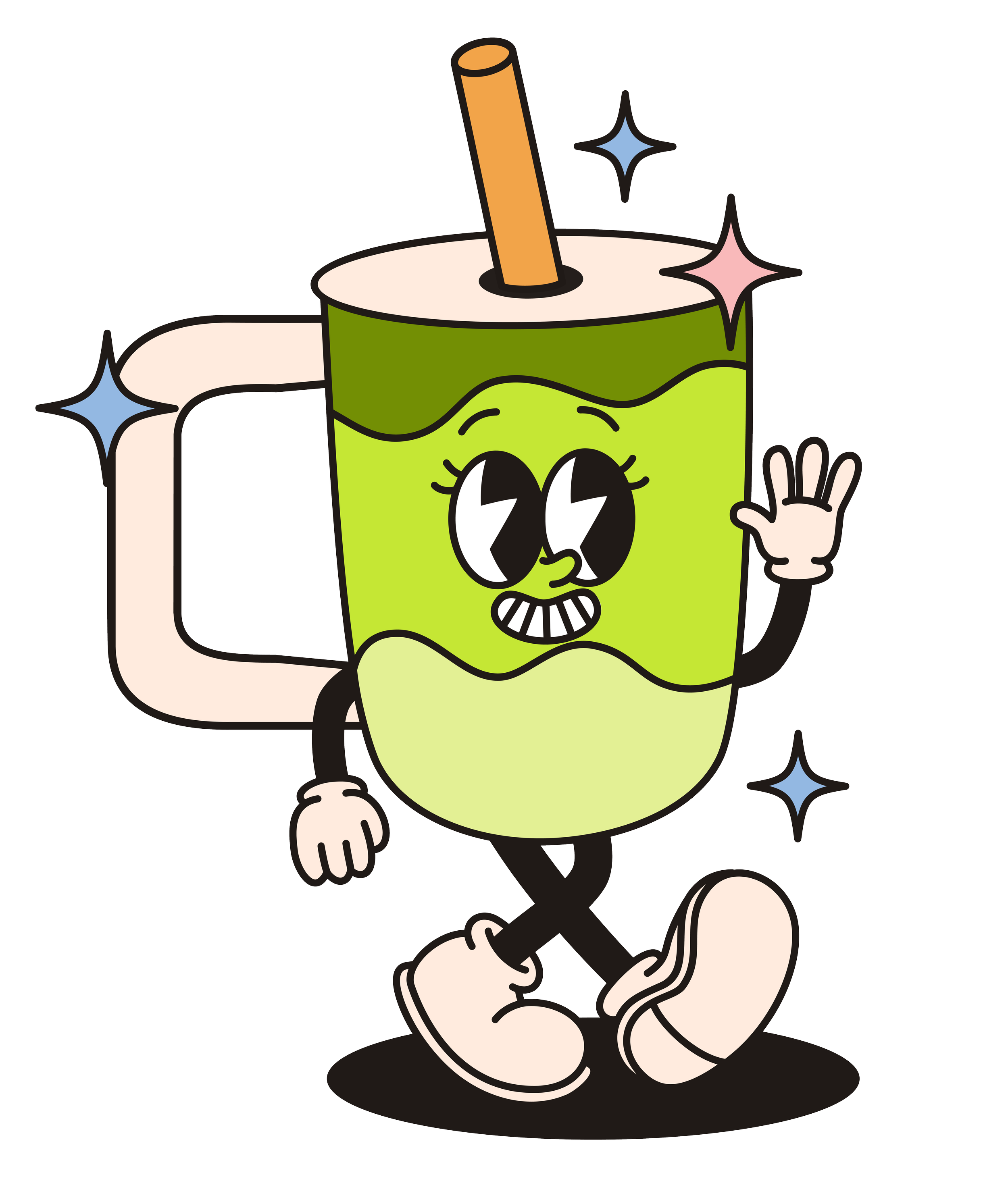
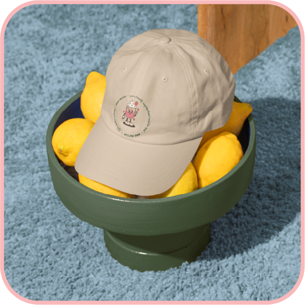
Bubbly, flirty, and maybe a little irreverent, Mika Matcha is the friend who texts in all lowercase, dots her i’s with a heart, and always knows a good “getting ready to go out” playlist.
Brand voice + tagline concepts
Logo design
Custom wordmark
Custom brand pattern
Color palette + typography
Packaging mockups (canned tea drink, sachets, stickers, punch card, etc.)
Social media post templates
Deliverables included: